
Set the visual job
Name the intended output before describing its style: a product shot, poster, explainer, portrait edit, or storyboard. A clear job helps the model decide what should lead the composition and what can stay in the background.
Give GPT Image 2.5 a written brief or a reference image, then direct the change you want. Choose Fast for exploration or Quality for closer control.
02
Treat each GPT Image 2.5 request as a production brief, not a wish list. Define the job first, identify the details that need to remain recognizable, and then name one change worth reviewing. This gives the first image a clear role and makes the next iteration easier to direct.
Name the intended output before describing its style: a product shot, poster, explainer, portrait edit, or storyboard. A clear job helps the model decide what should lead the composition and what can stay in the background.
When you add a reference image, say what must remain stable. That may be a product silhouette, a person's recognizable features, a material finish, a palette, or the hierarchy of an existing layout.
Change the setting, lighting, clothing, copy, object, or aspect ratio one at a time. Focused revisions are easier to judge because you can see whether the requested change arrived without disturbing the rest of the image.
01
GPT Image 2.5 is most useful when a single generation is only the beginning. Start from text when the visual direction is open, then introduce a reference image when a product, person, layout, or material needs to stay recognizable. The same workflow can move from a new concept to a focused adjustment without changing the creative brief every time.
01
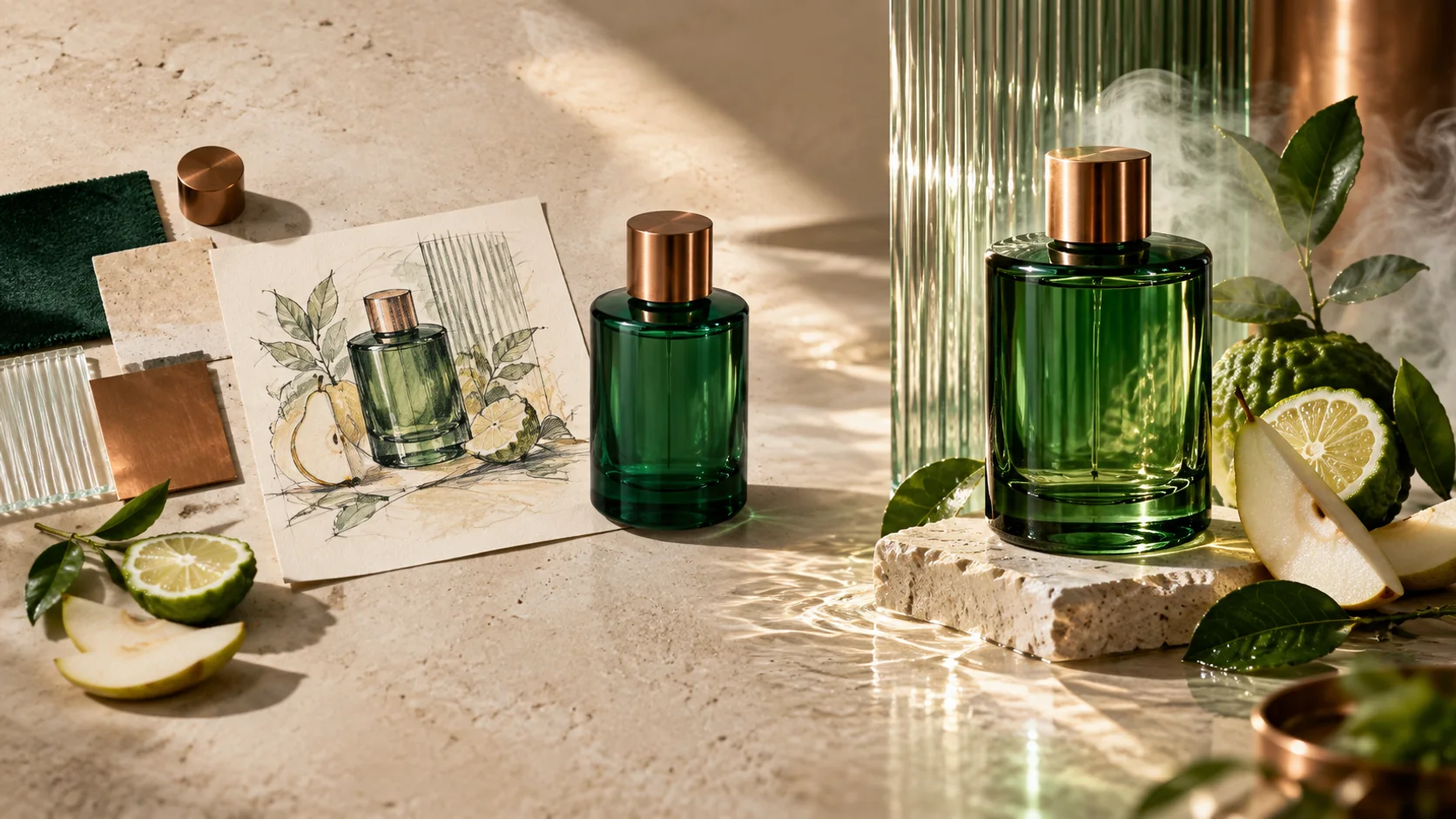
Reference images give a brief something concrete to hold onto. Use them when a product needs to remain recognizably yours while the setting changes, or when a character, object, or composition needs a new pose, background, or visual treatment. Be explicit about which details matter most instead of treating the whole image as equally fixed.
02
Focused editing is useful when the image is already close. You can direct a change to the background, an object, a color, a material, a text area, or the lighting while keeping the surrounding scene in view. Smaller instructions also make review simpler: compare the requested change first, then decide what to refine next.
03
Some images need more than a subject and a style. Product explainers, campaign graphics, interface concepts, and information layouts can combine objects, relationships, text, hierarchy, and scene direction. State the order of importance, where the eye should land, and which information must remain readable before adding decorative detail.
04
A rough drawing can be more useful than a long description when placement matters. Upload a sketch, wireframe, or simple composition study to communicate a room layout, object position, garment shape, or frame balance. Then use text to describe the finish, materials, lighting, and the degree of polish you want from the result.
03
Choose Fast when you are still establishing direction. It suits exploration, quick variations, and everyday production where you want to compare ideas before committing to one. Start here for a new concept, a different scene, or a simple change to an existing reference; move on once the brief has a clear winner.
Choose Quality when the decision is about finish and control. It is the better fit when reference details, a richer composition, a sensitive local change, or more deliberate material and lighting work need closer attention. Use it after the direction is clear and the remaining questions are in the details.
04
Good image directions also account for where the result will be used. GPT Image 2.5 controls help turn a creative brief into a usable frame: decide whether you are creating from text or editing an image, choose a proportion that suits the destination, and select the output resolution before reviewing fine detail. These choices reduce avoidable reframing later in the process.
01
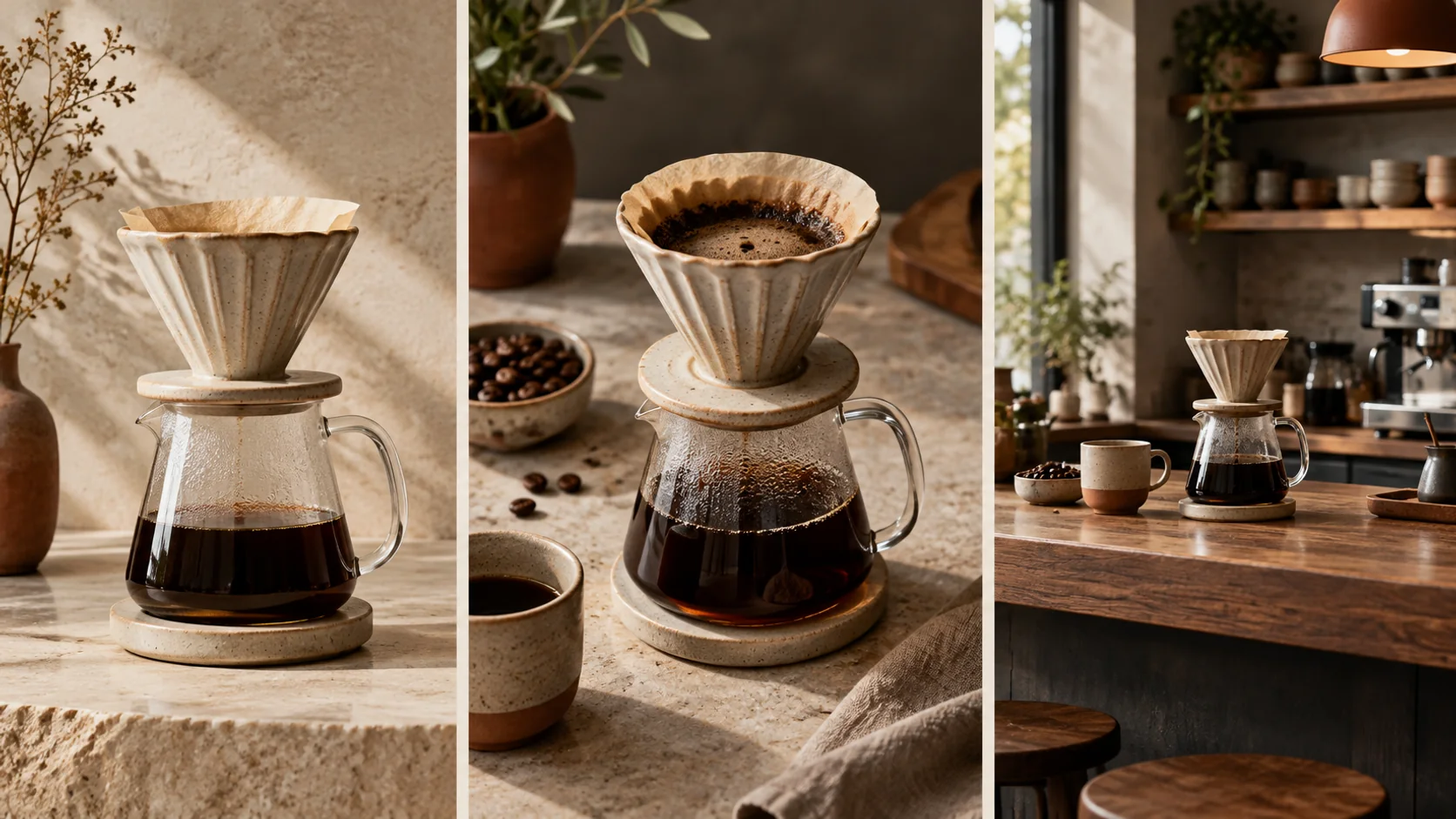
Use Text to Image when the brief begins with an idea. Use Image to Image when an existing visual should anchor the work. The difference is practical: a reference gives you a specific object, identity, or composition to protect while the written direction explains what should change.
02
Choose the frame with its final use in mind. A tall proportion can suit a story, poster, or mobile product moment; a wide proportion can suit a presentation, banner, or campaign scene. Setting the ratio early lets the composition form around the right space instead of being cropped into it later.
03
Resolution changes what is worth inspecting. At a larger output, look closely at small labels, edges, repeated patterns, material transitions, and the relationship between text and imagery. At any size, review the result in the context where it will be used before treating a draft as finished.
Case comparisons
Inspect five GPT Image 2.5 briefs with Fast and Quality shown side by side. The paired images make differences in layout, type, composition, and fine detail easy to review.
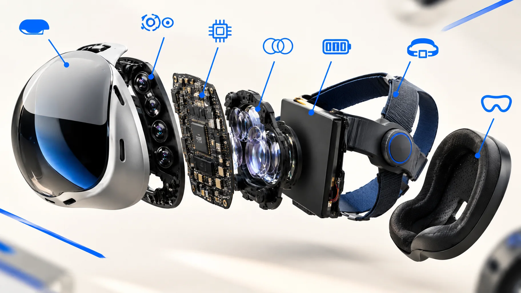
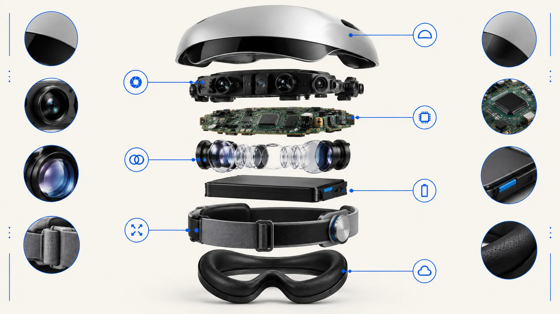
A labeled product breakdown that tests structural relationships, material cues, and visual hierarchy in one frame.
A dense illustrated scene that combines landmarks, food, labels, and a decorative map layout without losing the main route.
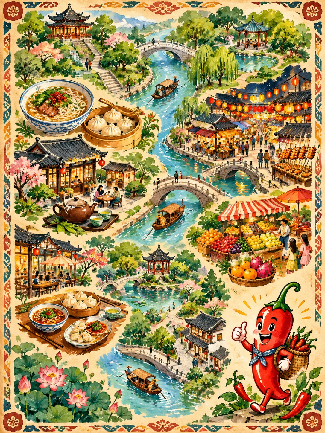
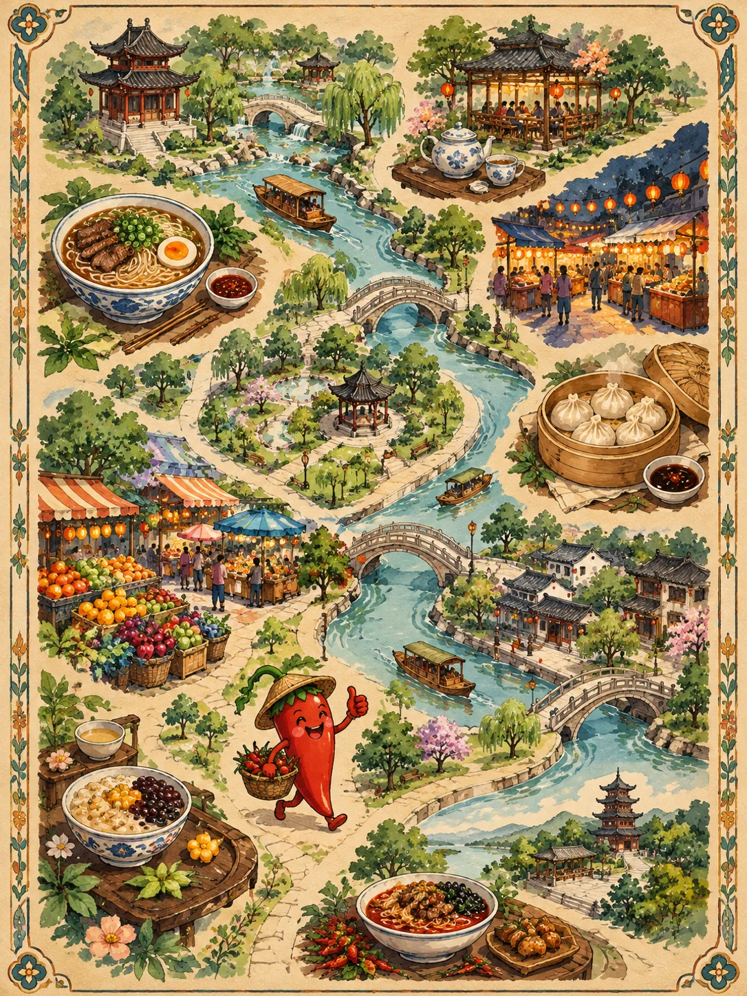
A creator-led commerce concept that combines product presentation, readable interface layers, and a clear purchase path.


A step-by-step product story arranged as a clear visual process, with stages that remain distinct at a glance.
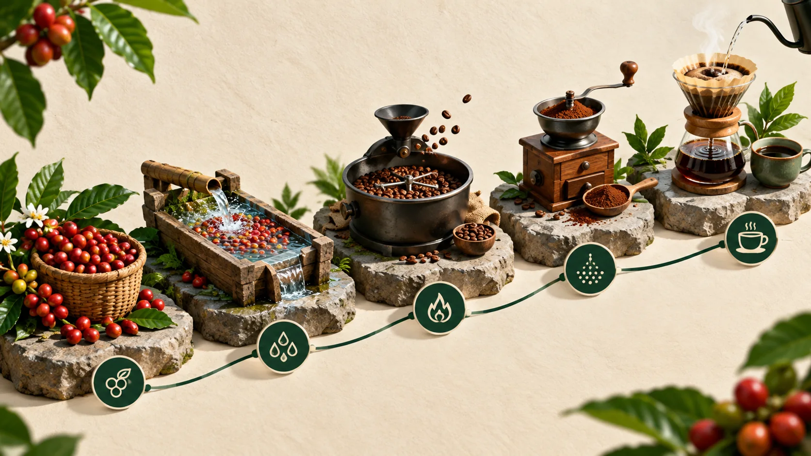
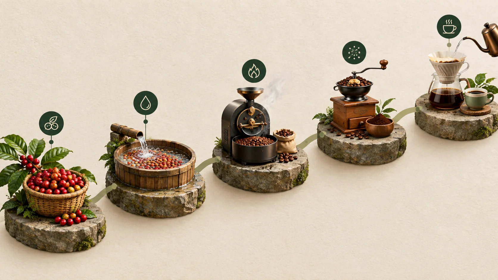
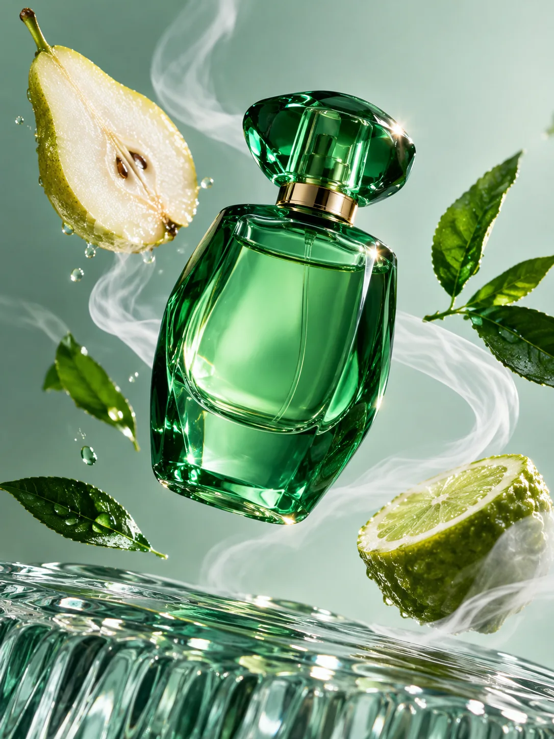
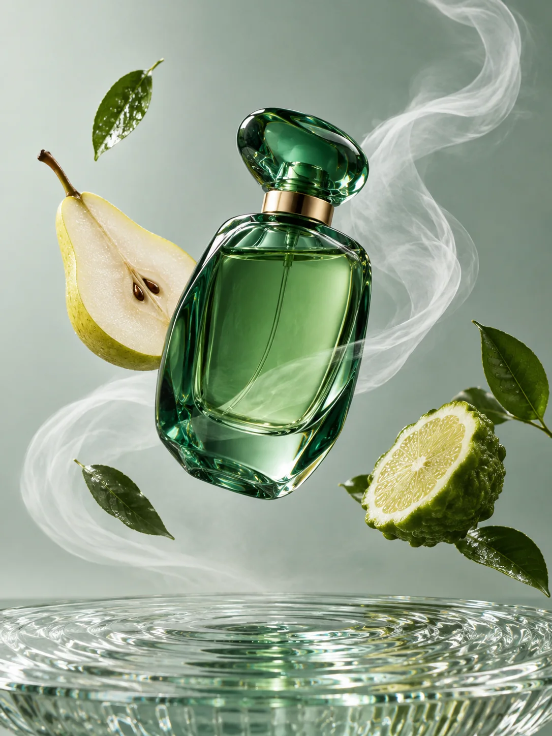
A premium product composition that tests translucent materials, liquid, controlled light, and a restrained editorial setting.
Compare monthly plans and one-time credit packs for GPT Image 2.5 image generation.
Use it to develop new image concepts, turn a reference into a different scene, refine a specific part of an existing image, or arrange a more structured visual such as a product explainer, campaign graphic, interface concept, or information layout.
No. Text to Image is useful when you are beginning with a written direction. Add a reference image when you need to preserve recognizable details, such as a product shape, a person, a composition, a material, or a color relationship.
Name what should stay stable before naming the change. For example, keep the product shape and label treatment, then change the surface, background, lighting, or placement. This is easier to review than asking for several unrelated changes at once.
Yes. A rough drawing can communicate placement and proportions when words are not enough. Use the sketch for structure, then describe the style, material, lighting, and finish you want in the prompt.
Use Fast to explore directions and produce quick variations. Choose Quality after the core direction is set and the brief needs more deliberate refinement around composition, reference details, materials, or a focused edit.
Choose the example closest to your job, then compare how each result handles the subject, layout, text, and surrounding scene. The cases are a way to inspect creative trade-offs before you write your own brief.
No. These are visual case comparisons, not a measured performance benchmark. They are designed to make the output characteristics relevant to creative work easier to inspect.
Ready when the brief is
Start with a written brief, add a reference when it matters, then choose Fast or Quality for the stage of work in front of you.
Open GPT Image 2.5 generator